New Look
In the last devlog I already mentioned that the visuals are a constant source of criticism. It was never the goal (and frankly speaking it's not realistic with the resources available) for Frame to have stunning graphics/artwork. Furthermore, I actually dislike how most games sacrifice visual clarity and clear visual communication for the sake of nice looks.
Because of all that I decided to substitute the textures and give Frame a "simpler" look. The new textures are white with simple patterns, together with black, beveled edges. The black/white look should make colored object stand out more and the black "outline" should make it easier to "parse" the geometry of the levels.
Additionally, there is one new level:
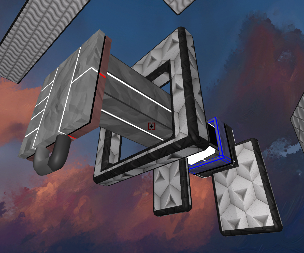 | 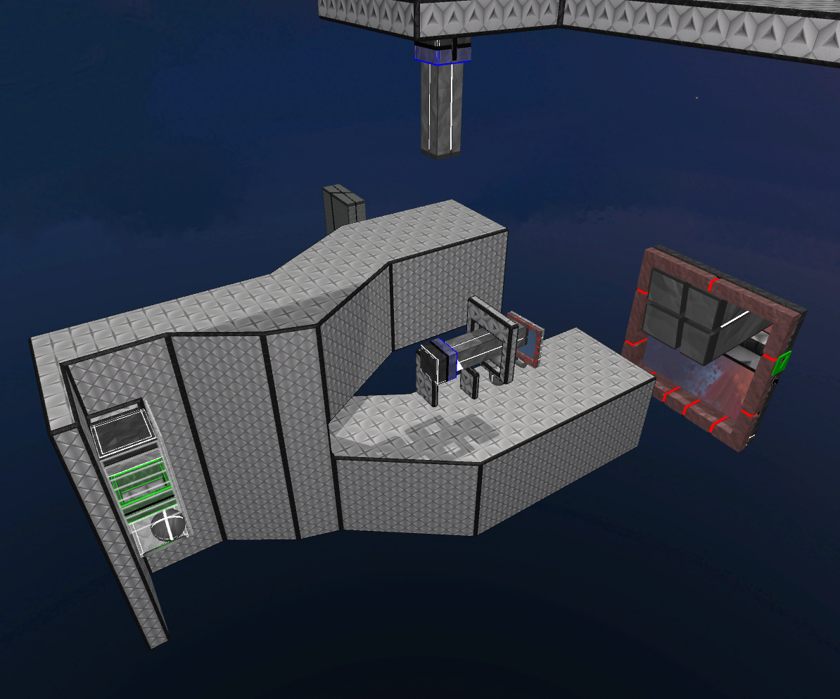 |
It's a rather simple level that combines carryable frames with gravity and size changes.
Other improvement are:
- a few more story lines at the end of the game
- the scroll bar in the level select menu works, now
- the character could tumble over during level-transitions, resulting in an unsmooth transition of the camera
- fixed a bug that could (under specific circumstances) lead to z-fighting of two different sky-boxes
Leave a comment
Log in with itch.io to leave a comment.